Hypercode Blog, #UX/UI Design
Introducing »Views by Hypercode«
We have plenty of test devices, simulators and browser DevTools at Hypercode. But when we’re on the go or taking a quick look on an iPhone, we usually only see the layout that fits its display. Our new app Views fills that gap: open a URL, compare multiple viewports and explore the details at each device size.
One Device. Many Perspectives.
Views shows a website at several device sizes side by side. The catalog includes all iPhone and iPad sizes, current Macs, selected Android devices and Bootstrap breakpoints. You can also define your own viewports. At a glance, you can see how your responsive web design holds up, where text wraps awkwardly or a navigation menu gets too crowded.
- Your choice of viewports: Pick smartphone, tablet, foldable and desktop sizes from an extensive device catalog, use Bootstrap breakpoints or set your own dimensions.
- Interactive previews: Scroll, click, follow links and open menus directly in each device viewport, with synchronized scroll positions.
- Live Reload and Auto Reload: Refresh previews when files change through the free Views CLI for Mac and PC, or automatically at a set interval.
- Fits your workflow: The Safari extension, Apple Shortcuts, URL scheme, CLI and Markdown guides for your AI coding agent are all included.
- Device screenshots: Capture individual viewports at device-specific sizes, share them with your team and make it easier to discuss and fix layout issues.
You’ll find all the features and more on our Views project page.
Free, With Pro Features Available
Views is free for iPhone and iPad and shows up to three viewports at once. Views Pro unlocks unlimited viewports, unlimited Live Reload and Auto Reload, and device-specific screenshots without the Views badge for a one-time in-app purchase of EUR 9.99.
We’d love for you to give Views a try. And please get in touch with any feedback, ideas or questions!

Enjoy the new perspectives!
Design & Development in Practice: Presenting Data-Driven Trade Fair and Event Apps at Media University
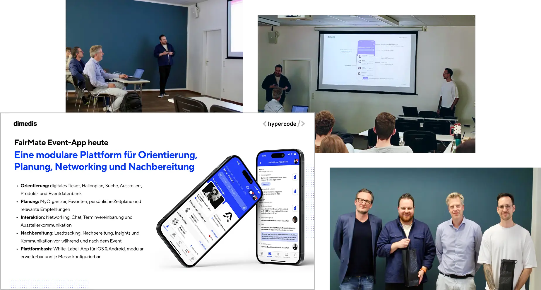
Before the new semester begins, we’re looking back at the previous one. At the invitation of Prof. Dr. Boris Becker, Florian and Stefan shared insights into the collaboration between our companies. Prof. Becker, who has been teaching the “Web Technologies” module with Stefan on the Digital Marketing and E-Commerce program in Cologne for the past two years, welcomed them alongside Prof. Dr. Alexander Rühle.
UX/UI Design and Technology for Trade Fair Visitors
Over an hour and a half, Stefan and Florian showed students how event apps can help people make the most of a trade fair: finding relevant content, navigating the venue and making the right connections.
Using the FairMate Event App as an example, they shared insights into our joint product development process. Hypercode has worked with dimedis as a strategic design and technology partner for several years, from concept development and UX/UI design to development for iOS and Android. The two shared lessons from this collaboration and explained how design and technical implementation work together.
Personalization and AI at Trade Fairs
One focus of the discussion was how content, recommendations and interactions can adapt to individual interests and the situation at hand. Florian and Stefan explained how data analysis can help deliver relevant information at the right moment. They also explored the potential of AI and intelligent matching: apps could suggest relevant contacts and offers, becoming personal trade fair assistants. It’s a topic they also explored in their masterclass at connect circle 2026.
Thank you to Media University and the students for the exchange. We’re looking forward to the new semester!
→ Read Media University’s report on the guest lecture
About Stefan’s Teaching
Stefan has been teaching “Web Technologies” and “User Experience & Web Analytics” at Media University since the summer semester of 2023. He brings experience from our daily work on digital products into the classroom, from the first product idea to the collaboration between design, development, stakeholders and service providers.
Welcome to the new hypercode.de!
The new hypercode.de grew out of a question: how can we better show who we are and what we do? A lot has changed. Hypercode has grown, our portfolio has evolved and we’ve raised our expectations of how we present ourselves1. The new website reflects that. It speaks more directly, shows more of our work and makes it clearer what we do for our clients.
Show, don't tell
We’ve built on the approach of the previous site. Hypercode is a Digital Product Studio with high standards, and we want that to come across from the first moment. More contrast, stronger accents and a visual language drawn from our work help make that happen. Less explaining, more showing.
That’s why the new hypercode.de features much more video, taken directly from our projects rather than stock libraries. New case studies show how those projects took shape, from strategy and planning to development. From the homepage showreel to individual project screencasts, the website gives you a closer look at our work than ever.
Spotlight: Our Services
Our redesigned service pages are central to the new site structure. They explain how we work and what we build. We’ve grouped them into What We Do, covering our expertise, and What We Create, showing the products and outcomes we deliver with our clients:
What We Do
- Product Strategy & Architecture — We help shape digital strategies and product ideas, advise on technology and architecture, and examine related business processes to identify solutions early.
- UX/UI Design — We create engaging user experiences with a design language tailored to each client. Working closely with development lets us carry complex design requirements through to the finished product.
- Software & Web Development — We build fast, intuitive mobile apps, web-apps, configurators, websites and web services that people enjoy using.
What We Create
- Mobile Apps for iOS & Android — We build mobile apps that work well across platforms, combining reliable engineering, clear design and integration with the systems they need. Our work spans hybrid architectures and native device features.
- Corporate Websites — We design and build custom websites that make complex content easy to navigate, communicate technical expertise and engage visitors through fast performance and thoughtful interactions.
- Web-Apps & Product Configurators — Interactive tools that help people make decisions and speed up processes. Modular and scalable, they fit into existing systems and business models.
- Custom Software — When off-the-shelf tools fall short, we build software around your requirements, with modular architecture, room to scale and a clear focus on maintainability and efficiency.
You’ll also find the occasional Easter egg. We think a business website should be fun, too. 🐣 Enjoy exploring — and, as always, we’d love your feedback and suggestions!
Footnotes
- Our clients have had a glimpse of this for a while: our presentations and communications have reflected the new direction, including the color palette, for several months. ↩
WALZWERK App: An Interactive Site Map with Tenant Search and GPS Navigation

WALZWERK is home to businesses in digital technology, e-commerce and education, and a popular destination for culture and leisure in the Cologne area. The 35,000-square-meter site in western Pulheim welcomes business visitors and members of the public every day. Alongside companies and studios, it houses a theater, swimming pool, restaurants, a church and artists’ workshops. With so much spread across the site, finding your way can be a challenge.
Since December, the WALZWERK app at app.walzwerk.de has been helping visitors get around:
- Interactive site map and tenant search — Find tenants and studios quickly, see them marked on the map and follow a live route from your GPS location.
- Real-time GPS navigation — Directions update on the map as you move towards your destination. If GPS is unavailable, the route starts at the main entrance road or the sign whose QR code you scanned.
- No installation needed — The app runs directly in the browser. Signs with QR codes around the site help visitors find it.
- Mobile and desktop — It works on smartphones, tablets and desktop computers, so directions can be viewed and shared anywhere, including in an email signature.

Protecting visitors’ data was a priority. GPS location is used only for navigation and stays on the visitor’s device. It is neither stored nor processed for any other purpose.
The WALZWERK app connects directly to the site’s digital tenant directory, keeping information up to date and applying changes automatically.